Tutorial: Compute a Confusion Matrix using scikit-learn
In machine learning, a confusion matrix is typically computed to evaluate the performance of a trained classfication model.
The example below will show you how to compute confusion matrices using scikit-learn.
tldr:
from sklearn.metrics import confusion_matrix

cm = confusion_matrix(df['y_test'], df['y_pred'])
Definition
A confusion matrix shows you the count of true positives, false negative, false positives and true negatives, respectively:
| ↓actual \ predicted→ | class=1 | class=0 |
| class=1 | true positives (count) | false negatives |
| class=0 | false positives | true negatives |
Example
Suppose you trained a model that classifies images into either containing a dog or a cat.
Step 1: Look at the data
Suppose you have the following predicted labels (y_pred) and actual labels (y_test):
import pandas as pd

# 0: dog, 1: cat
data = {
  "y_pred": [1, 0, 1, 1, 0, 1],
  "y_test": [1, 0, 1, 0, 0, 1]
}

df = pd.DataFrame(data)

print(df)
   y_pred  y_test
0       1       1
1       0       0
2       1       1
3       1       0
4       0       0
5       1       1
Step 2: Compute the confusion matrix
Use scikit-learn's confusion_matrix function to compute the matrix:
from sklearn.metrics import confusion_matrix

cm = confusion_matrix(df['y_test'], df['y_pred'], labels=[1, 0])

print(cm)
[[3 0]
 [1 2]]
As you can see, the above code gives you the confusion matrix, but it is not really useful in its current form.
Step 3: Plot the confusion matrix
Let's make it more human-readable by plotting the matrix. The following function does the job (feel free to customize it to your liking):
import matplotlib.pyplot as plt
import numpy as np
import itertools

def plot_cm(cm, labels, cmap=plt.cm.BuPu):

    plt.imshow(cm, interpolation='nearest', cmap=cmap)
    plt.colorbar()
    tick_marks = np.arange(len(labels))
    plt.xticks(tick_marks, labels)
    plt.yticks(tick_marks, labels)

    threshold = cm.max()/2
    for i, j in itertools.product(range(cm.shape[0]), range(cm.shape[1])):
        plt.text(j, i, format(cm[i, j]),
                 horizontalalignment='center',
                 color='white' if cm[i, j] > threshold else 'black')

    plt.ylabel('Actual label')
    plt.xlabel('Predicted label')
    plt.tight_layout()
    plt.show()
To come back to our example, here is the corresponding plot:
plot_cm(cm, labels=['cat', 'dog'])
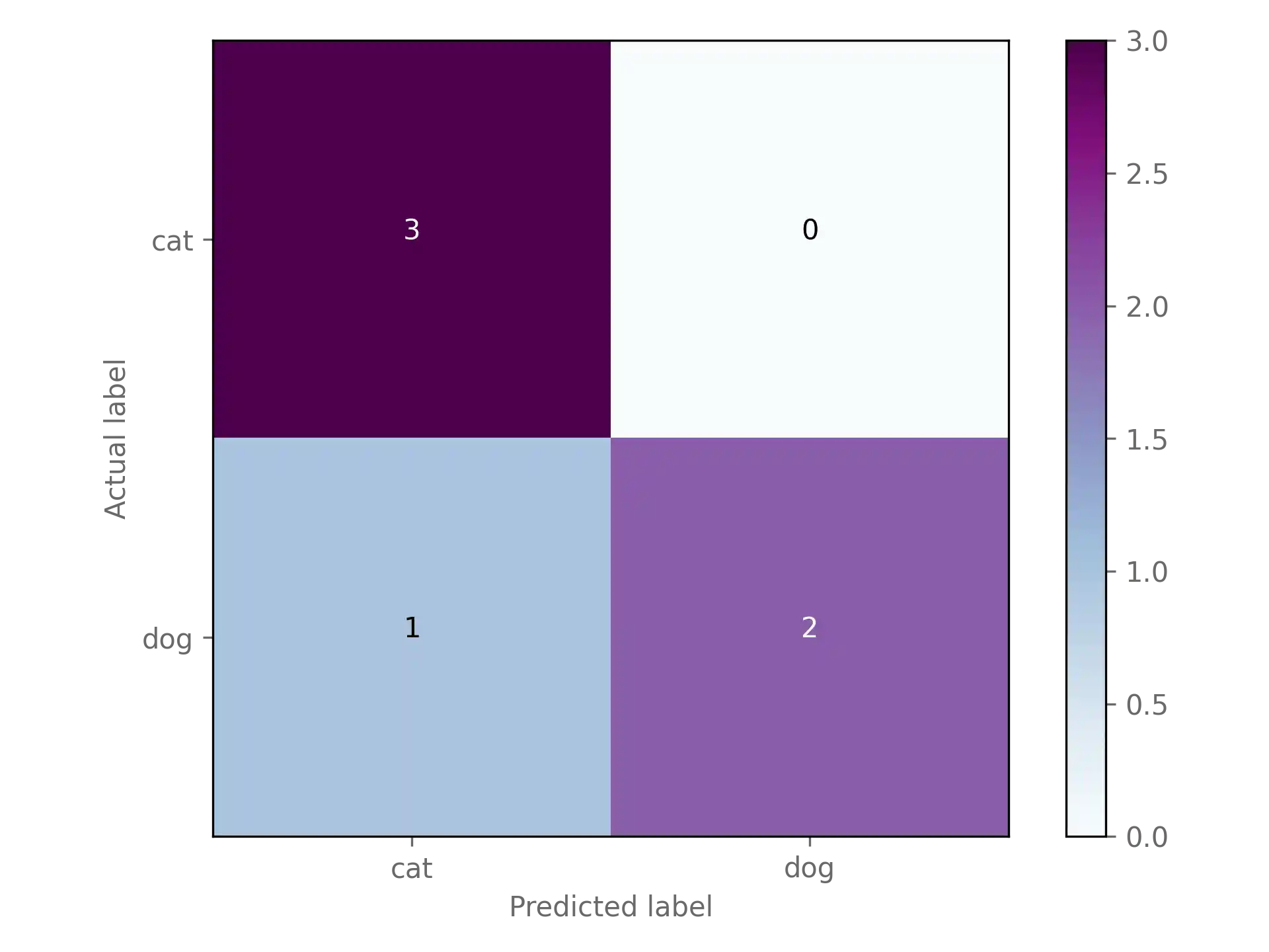
Looks much better!
Optional: Classification report
A confusion matrix gives you a first indication of how well your classification model performs. However, often you will find yourself needing an evaluation metric that allows you to compare models more easily.
Here are the definitions of four commonly used classification evaluation metrics, where denotes true positives, true negatives, false positives, false negatives:
scikit-learn let's you easily compute all four metrics using the classfication_report function:
from sklearn.metrics import classification_report

cr = classification_report(df['y_test'], df['y_pred'], labels=[1, 0])

print(cr)
              precision    recall  f1-score   support

           1       0.75      1.00      0.86         3
           0       1.00      0.67      0.80         3

    accuracy                           0.83         6
   macro avg       0.88      0.83      0.83         6
weighted avg       0.88      0.83      0.83         6
Conclusion
You just learned how to compute and visualize a confusion matrix using scikit-learn.
As a next step, you could learn more about evaluation methods of classfication models.